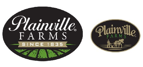
Plainville Farms

Same great product, new look.

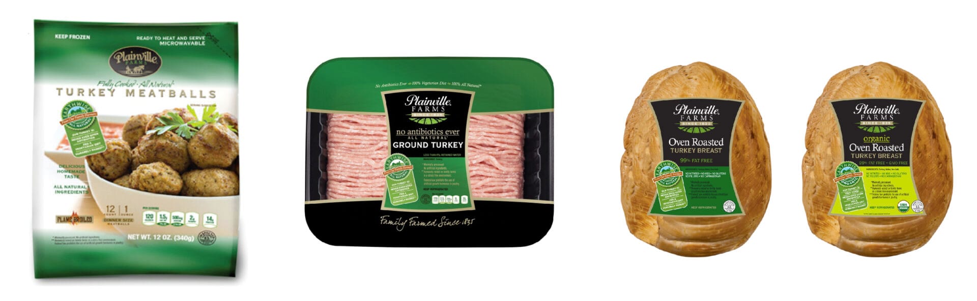
SITUATION: We had the opportunity to update the logo and packaging.

APPROACH: Our creative goal for the logo was to be respectful of the past while being relevant to the future. As an example, you will see how we expressed the longevity of the brand by replacing the old plow graphic with a date. Also, in response to consumer research, we thought it was important to give the word “Farms” much more presence, paying respect to the farm-to-table movement.

OUTCOME: Consumer focus groups were overwhelming in their preference (and frankly, love) of the new look. New packaging followed, not only incorporating the new logo, but changing label shape as a subtle reminder that poultry is a leaner choice. There has been double digit growth in brand sales, year after year, since 2011. These birds are three times more expensive than “traditional” turkey, so this is even more impressive considering the economic climate. One promotion, Thanksgiving Central, brought about 75,000 new visitors to the website in November alone. We ran a “Win a Turkey” contest on Facebook that garnered almost 6,000 entries. And as another fun fact, Fathers Day and Back to School Promotions resulted in significant increases and participation, with Facebook likes up 49.4% over the prior year.

AUDIENCES: Food service, upscale retail, consumers

ELEMENTS: Logo, packaging, POS, print